Calibri or Georgia: the two-font system that survives every parser
Two system typefaces, a 10pt floor and margins nobody notices. What the deliberately boring font system did to interview rates.

Ask ten designers to name the best resume fonts and you will get ten mood boards. Ask a parser and you will get four names: Calibri, Georgia, Arial and Garamond. The distance between those answers is where most resume typography advice falls apart, because the advice is written for human readers and resumes are screened by software first.
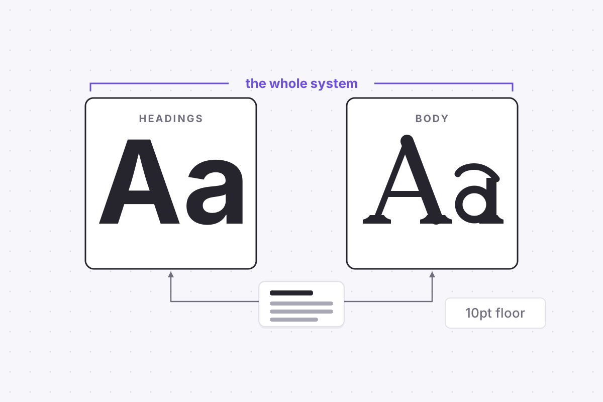
So here is the entire system, up front. Pick one sans-serif and one serif from the system-standard set. Use one for headings and the other for body text. Set the body at 10pt or larger. Keep margins between roughly 1.5 and 2.5cm. Stop. It is deliberately boring, and the boredom is doing the work.
Two typefaces, no exceptions
The case for staying with Calibri, Georgia, Arial or Garamond has nothing to do with taste. It is about rendering. System-standard fonts ship with every operating system and every PDF viewer, so your file displays identically wherever it lands: the recruiter's laptop, the hiring manager's phone, and the applicant tracking system that reads the document before either human does.
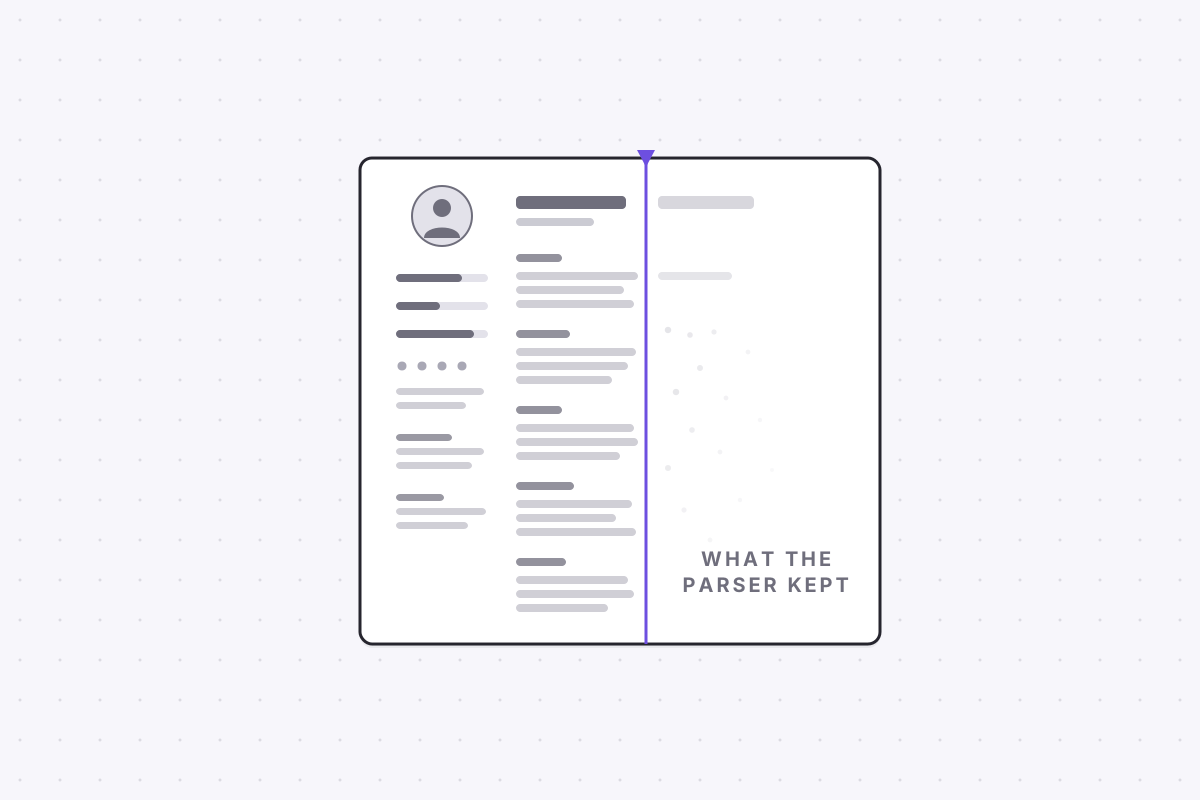
Decorative fonts do not fail gracefully. Depending on how the file was exported, a display typeface can embed as vector outlines rather than as text, or map to glyphs a parser cannot convert back into characters. To you the page looks styled. To the machine, whole sections read as garbage or as nothing at all. The extreme version of this failure is common enough that we covered it on its own: the parser can see a blank page where you see your best work.
The pairing rule is where the small amount of design lives. One sans-serif for headings, one serif for body, or the reverse. Calibri headings over Georgia body is the classic combination; Arial over Garamond works just as well. The contrast between the two faces creates hierarchy with zero design skill, and the consistency, the same two faces doing the same jobs on every line, makes the page look deliberate rather than default. Contrast plus consistency. That is the whole trick, and it cannot be done with one font or with five.
The 10pt floor, and why smaller backfires
Resume font size has a practical floor at 10pt. Below it, legibility drops at exactly the moment it matters most: a recruiter skimming your page in a handful of seconds, often on a smaller screen than the one you wrote it on. Text that forces a reader to lean in does not get leaned into. It gets skipped.
Shrinking text is almost always a symptom of a different problem, which is too much content chasing a one-page target. A resume set at 9pt with eight bullet points per role does not read as thorough. It reads as cramming, and cramming signals an inability to prioritise, which is close to the opposite of what a resume exists to demonstrate. If the page does not fit at 10pt, cut content rather than compressing it.
And before fighting too hard for a single page, check whether the one-page rule even applies to you. It is a North American convention rather than a law of nature, and resume length rules change at the border.
Margins nobody notices, which is the point
Margins between roughly 1.5 and 2.5cm, or 0.6 to 1 inch, hold a clean one-page layout together. Nobody has ever complimented a candidate on their margins. Everybody notices when they are gone. Text running to the edge of the paper is one of the fastest ways to make even a professional resume font look desperate.
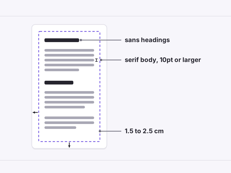
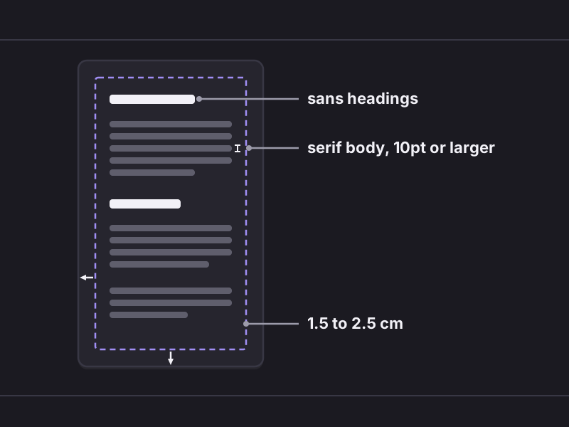
White space is not wasted space; it is what lets a skimming reader find section boundaries without actually reading. A page with honest margins and 10pt text says the candidate had enough material that mattered, said it, and stopped. A page with 0.5cm margins says the opposite, whatever the words on it claim.
What the best resume fonts do to parsers, and what they signal to humans
ATS friendly fonts solve the machine problem first. The parser extracts real text, fields land where they should, and your dates, titles and employers survive the trip into the database intact. The four system fonts pass this test everywhere for a simple reason: there is nothing exotic in them to fail.
The same choice sends a human signal, and it is worth naming. A recruiter who has read thousands of resumes registers Calibri or Georgia as neutral, so the typography disappears and the content carries the page. An unusual font makes the reader aware of the typography, and attention spent on typography is attention not spent on your work history. The best resume fonts are the ones nobody consciously notices.
If you would rather have proof than argument, run the finished file through a parser and read what comes out the other side. ApplyHustle's free ATS check exists for exactly this, and seeing your resume the way the ATS sees it settles a font debate faster than any style guide.
What the boring system did to interview rates
Among candidates on ApplyHustle who switched from a designed template to the two-font system, we have seen a consistent pattern: interview invitations rise, often within the first few weeks of applying. That is an observed pattern among our users, not a controlled study, and the mechanism behind it is unglamorous. The resumes did not become more persuasive. They became fully machine-readable, so more of them survived parsing and reached a human at all.
That is the honest case for boring. Calibri or Georgia will not win you an interview. They stop typography from losing you one, and at the top of a hiring funnel, not losing is most of winning. Set the two fonts, hold the 10pt floor, keep the margins, and spend the attention you saved on the words.