Your resume is beautiful. The parser sees a blank page.
Two columns, skill bars, icons, a tasteful header. Each one invisible or worse to a parser. The resume design that survives the machine.
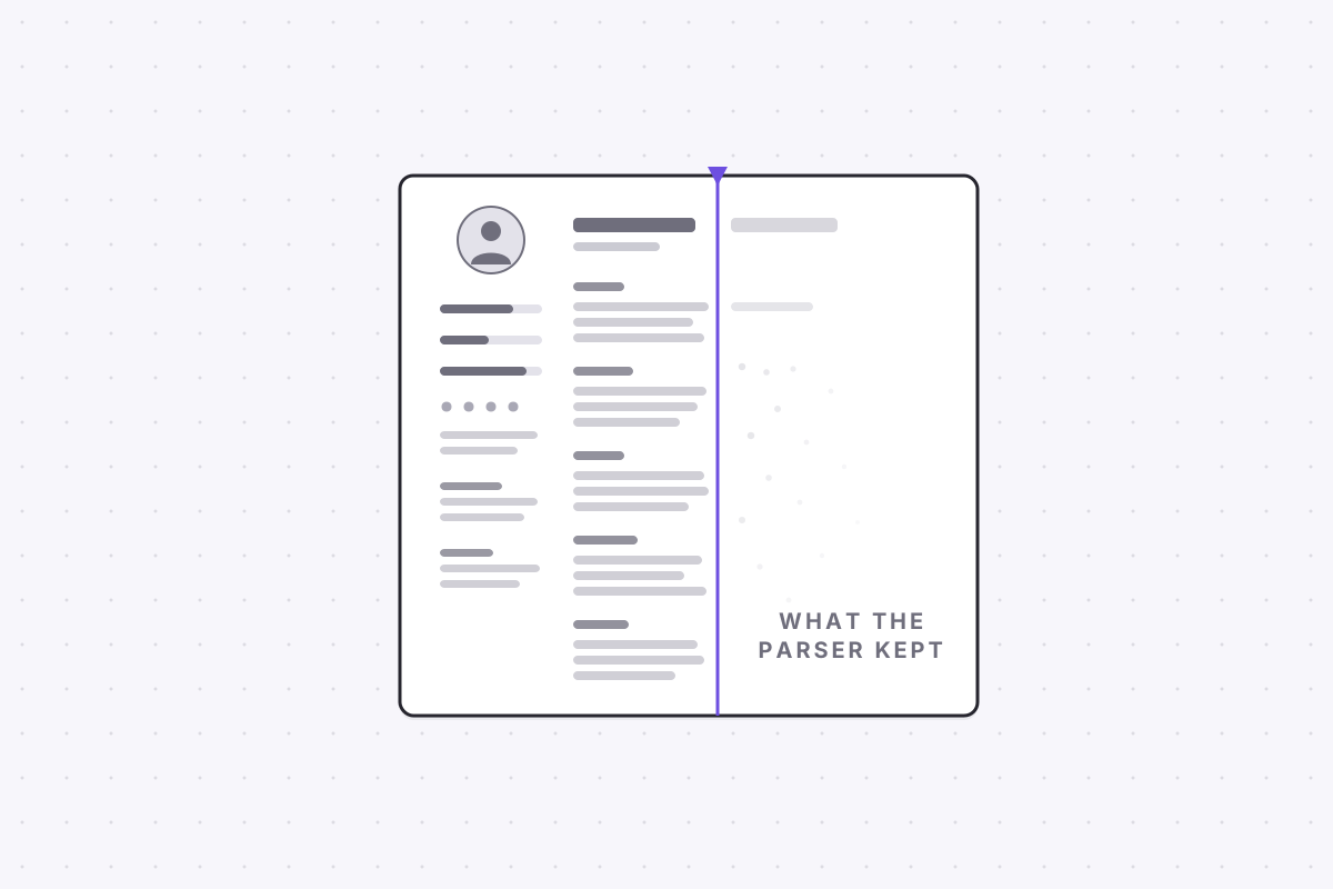
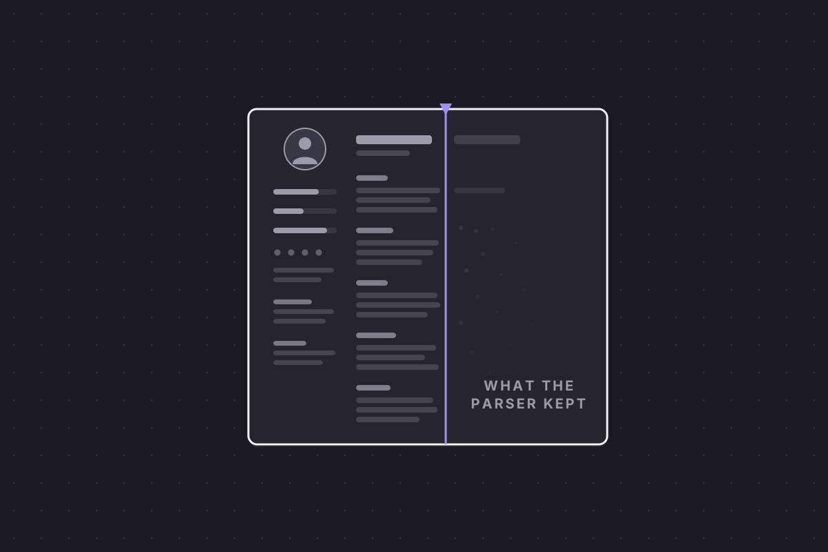
There is a specific heartbreak in job hunting: the resume you spent a weekend designing, two balanced columns, a skills sidebar, a tasteful set of icons, that never produces a callback. The design is rarely the problem in the way you think. The problem is that an ATS friendly resume format and a visually impressive one are judged by different readers, and the machine reads first.
Before a human opens your file, parsing software converts it into structured data: name, contact details, work history, education, skills. Whatever survives that conversion is your actual application. Whatever does not survive was never submitted, however good it looked on your screen. Understanding how the conversion works is the difference between an ATS friendly resume and a lottery ticket.
How a parser reads: top to bottom, one column at a time
A parser does not see a page. It linearises the document into a single stream of text, top to bottom, then segments that stream into fields: this block is a job title, this line is a date range, these tokens are skills. Both steps can fail, and layout is the usual culprit.
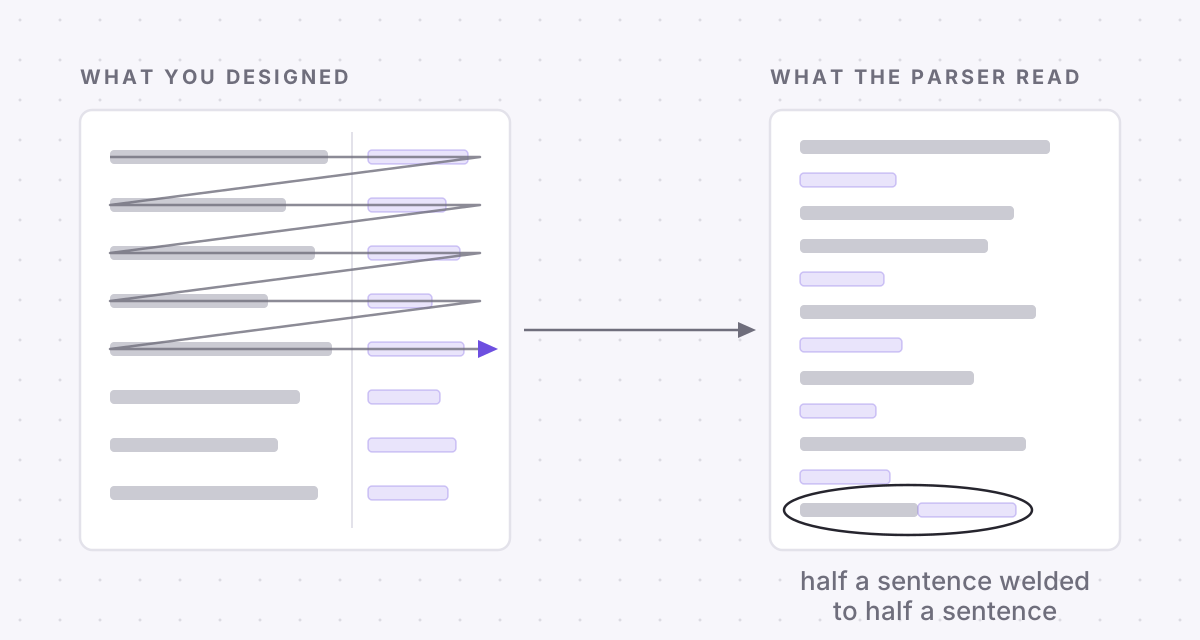
Multi-column layouts fail at the first step. Many parsers read straight across the page, so a line from your skills sidebar gets spliced into the middle of a job description, and the parser now believes a stray sidebar phrase is part of a sentence about your degree. A two column resume can survive a modern ATS, but whether it does depends entirely on which parser the employer runs, and you do not get to choose the parser.
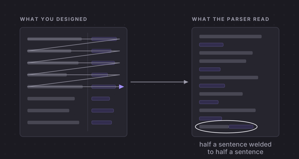
Tables fail at the second step. Table cells are stored in an order that has little to do with their visual arrangement, so a work history laid out in a table can come out with employers detached from dates and titles attached to the wrong company. The chronology you arranged so carefully arrives scrambled, and a scrambled work history reads like a hidden gap even when there is none.
The five design choices that scramble your data
Across the resumes we see, five choices account for most of the parsing damage.
- Multi-column layouts, which interleave unrelated lines whenever the parser reads across the page rather than down each column.
- Tables used for structure, which scramble the order of your work history when the cells are extracted.
- Contact details placed in the document header or footer. Some parsers skip headers and footers outright, which makes this the single most expensive square inch on the page: everything else parses perfectly and the recruiter still cannot reach you.
- Text boxes and floating graphics that hold real content, because many parsers read only the main document flow and never look inside floating objects.
- Fonts converted to outlines, or text saved as an image, which turn words into pictures of words. A picture of the word Python contains no Python.
None of these is a typo you can catch by proofreading. The document looks perfect. The data underneath it is wrecked, and you find out months later as silence.
Skill bars, icons and other decorations that vanish
Skill bars, star ratings and icons carry no machine-readable text at all. A five-star rating next to Excel parses as nothing; the parser records no Excel and no rating, so the decoration costs you the exact keyword it was drawn to celebrate. The same goes for a progress bar showing 80 percent JavaScript. Eighty percent of what, measured how? Even a human cannot answer that, and the machine does not try.
Icons have a subtler version of the same problem. A phone glyph next to your number looks obvious to a person, but a parser matching on the words phone or tel may never associate those digits with a phone number. Spell things out. Labels are unfashionable, and they work.
These decorations are weak signals for the human reader too. Recruiters spend seconds per document, and what happens in the six seconds after you hit apply does not include admiring a star rating. Every centimetre spent on decoration is a centimetre not spent on an achievement with a number in it.
PDF or Word: the answer that actually matters
The perennial format question has a boring answer: modern ATSs read PDFs fine, provided the text layer is real. The dangerous divide is not PDF versus Word. It is real text versus a picture of text.
A PDF exported from a word processor keeps its text layer and parses cleanly. A PDF exported from a design tool can flatten pages into images or convert fonts to outlines, and that file parses as blank. Same extension, same appearance on screen, completely different machine outcome. This is how the most beautiful resumes end up invisible, and it is why resume templates sold on design marketplaces deserve suspicion before an ATS: many are built in exactly the tools that produce these files.
There is a ten-second test that catches most of it. Open your resume, select all, copy, and paste into a plain text editor. What you see is roughly what the parser gets. If the order is scrambled, your columns are interleaving. If chunks are missing, they lived in images or text boxes. If your name comes out as boxes and question marks, your font did not embed as text. And if the paste is empty, so is your application.
For a closer look than the paste test gives, run the file through an actual parser. ApplyHustle's free ATS check will show you your resume the way the ATS sees it, field by field, which turns an anxious guess into a checklist.
Hierarchy without tables: an ATS friendly resume format that survives
The good news is that everything the decoration was trying to do can be done with typography, and typography parses. A single column. Standard section headings: Experience, Education, Skills. Bold for job titles, regular weight for employers, one consistent date format on every role. Size and weight create the hierarchy that columns and colour blocks were faking, and every character of it survives the parser.
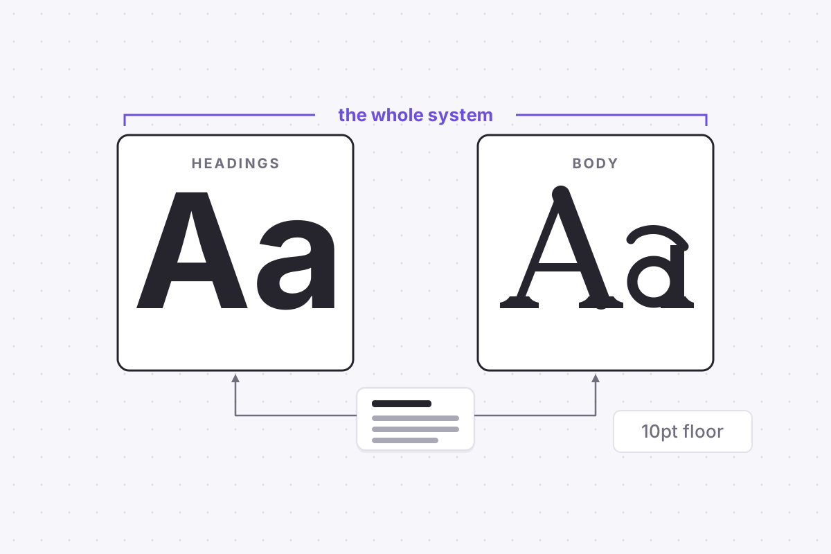
Two fonts are enough to run the entire system, one for headings and one for body, and the two-font pairing that survives every parser covers the specific choices. Most resume formatting mistakes are not a lack of design talent. They are the result of designing for the wrong reader first.
Write for the machine, format for the skim, and the weekend you used to spend on the sidebar goes where it belongs: into the sentences a human will finally get to read.