Your cover banner is a billboard you're leaving blank
1584 by 396 pixels of free advertising, and most profiles still run the default gradient. What to put there instead, by role and seniority.
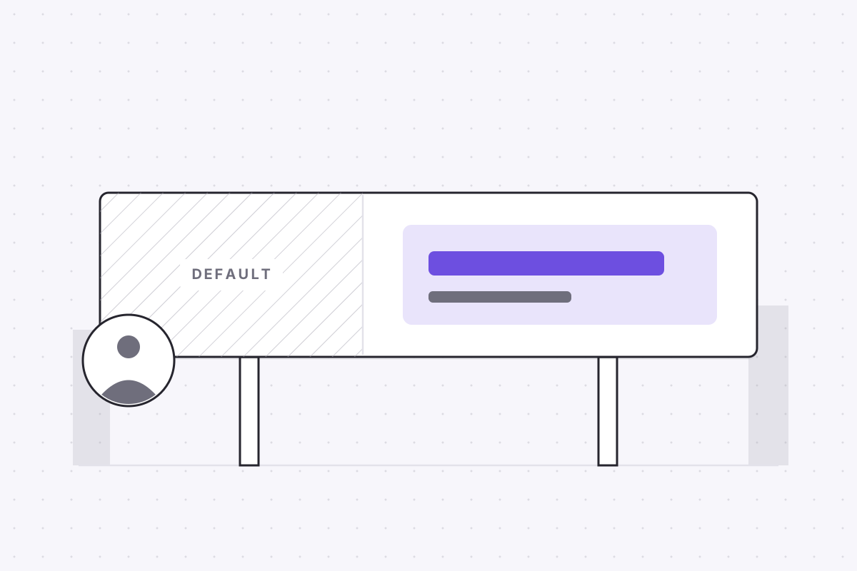
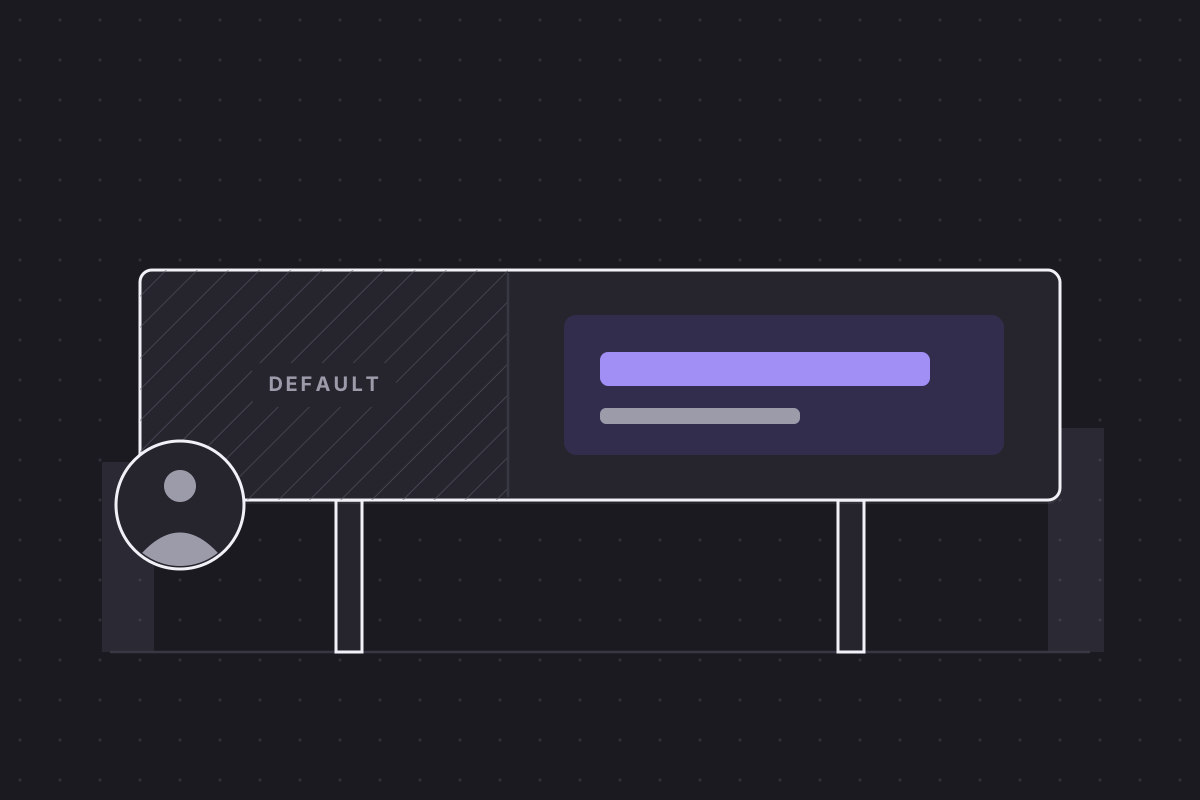
A recruiter forms an impression of your profile before reading a single word of it, and the banner does most of that work. It is the largest visual element on the page, it loads first, and it frames both your photo and your headline. Most people leave it as the default gradient, which is why the LinkedIn banner size is worth knowing exactly: 1584 by 396 pixels of advertising space that costs nothing and that almost nobody uses.
The LinkedIn banner size: 1584 by 396 pixels of free advertising
The specification first. The LinkedIn background photo is 1584 by 396 pixels, a 4:1 ratio, uploaded as a JPG or PNG of up to 8MB. Supply anything else and LinkedIn stretches or crops it for you, rarely kindly. A 4:1 canvas is an odd shape, closer to a stadium hoarding than a poster, and designs borrowed from other formats tend to die in it.
Billboard rules apply. A driver gets a few seconds and about seven words; a scrolling recruiter gives you roughly the same. One message, legible at a glance, beats anything clever, and it should answer the question the viewer is already asking: what is this person for?
Why the default gradient reads as "no effort"
The default banner is not neutral. To someone who reviews dozens of profiles a day it signals that you have not considered this surface at all, much as the grey silhouette avatar once did. Fairly or not, visible effort on a profile is read as a proxy for effort in general.
Of all the linkedin profile tips in circulation, replacing the banner has the best ratio of effort to visible difference. It is one image, changed once, seen by every recruiter, hiring manager and former colleague who ever opens your page.
What to put there: students, career changers, senior hires
The right content depends on what you need a viewer to believe within three seconds, and that varies by situation.
- Student or recent graduate: the evidence your experience section cannot show yet, such as skills, a project screenshot or a short portfolio URL.
- Designer or developer: the work itself. One shipped interface or product shot outperforms any slogan about craft.
- Career changer: the destination field, not the old one. The banner can say data analytics while your history still says retail management.
- Senior hire: a one-line positioning statement, or a photo of you speaking at an industry event. Authority shown, not claimed.
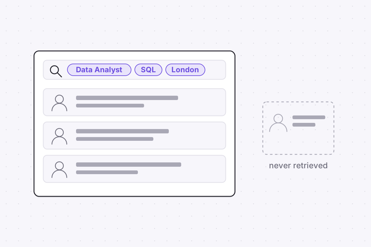
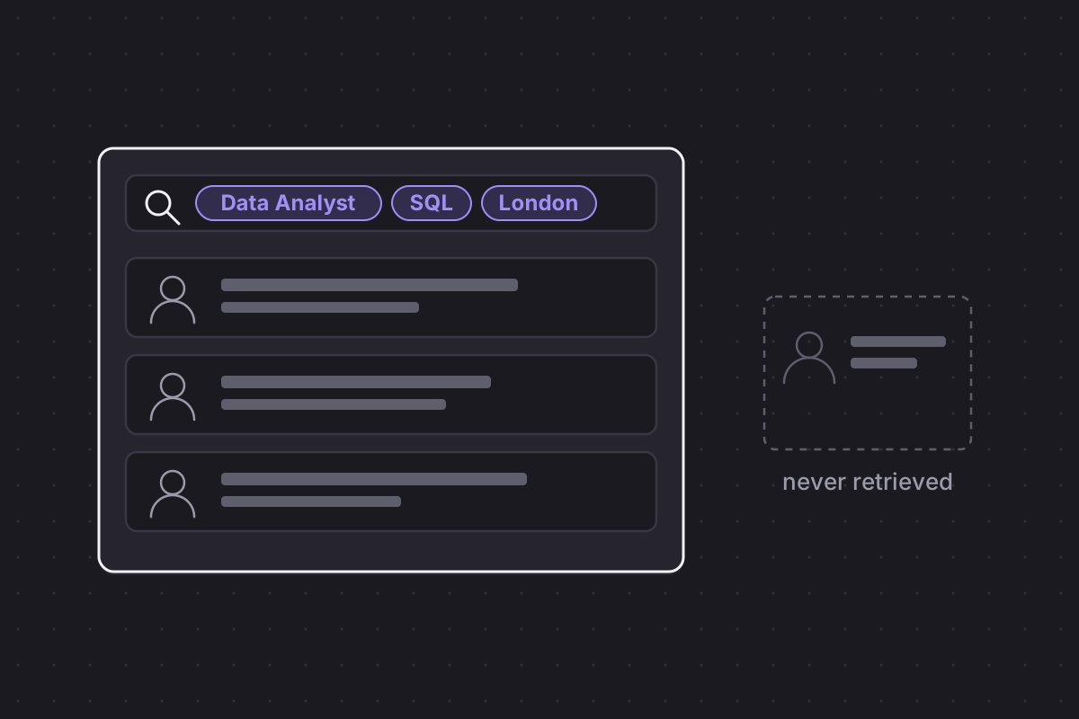
Keep it in proportion, though. The banner frames a profile; it does not rank it. Recruiters find you through keywords before they ever see your design, and an invisible profile with a beautiful banner is still invisible: you don't have a LinkedIn problem, you have a search problem. ApplyHustle's LinkedIn Analyzer will show you how the whole profile scores, banner included.
The photo overlap and the mobile crop that eat your design
Two constraints ruin most first attempts. The profile photo overlaps the lower-left corner of the banner, so anything placed there, a logo, a line of text, a second photo of your face, disappears behind the circle. And mobile trims the sides of the image to fit a narrower screen, so content pushed to the edges vanishes for most viewers.
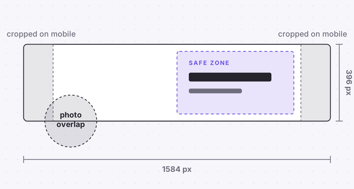
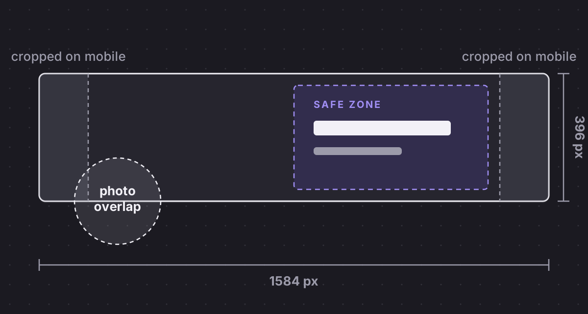
The practical rule is to keep key content in the safe zone right of centre, clear of the bottom-left quarter and the outer edges. Then check the result on a phone before calling it done, because most recruiters will meet your banner there, not on a desktop monitor.
A plain coloured background with one line of well-set text passes both tests without any design skill. If you build something fancier, export it at exactly 1584 by 396 so the upload is not resampled, then look at it once at thumbnail size. A message that survives the thumbnail survives anywhere.
Banners that backfire
Three choices reliably make a banner worse than the default. Dense text, a paragraph of services or a wall of certifications, becomes unreadable after the mobile crop. Stock photography, the city skyline or the handshake, says nothing about you and is recognised as filler instantly; many lists of linkedin cover photo ideas are padded with exactly this. And any banner that contradicts the headline below it, say a "seeking opportunities in finance" graphic above a marketing headline, costs you credibility on the spot.
The banner is twenty minutes of work, once, and it runs the same logic as choosing to apply to 10 roles well, not 100 badly: a small number of deliberate choices beats a large number of defaults. Your profile already owns a billboard. The only question is whether it is advertising you, or advertising nothing.